Passing with flying coloursColour isn't universal - context is everything

INSIGHTS / Guide 01 / Using Colour
James Clarke, Education Consultant - March 2026
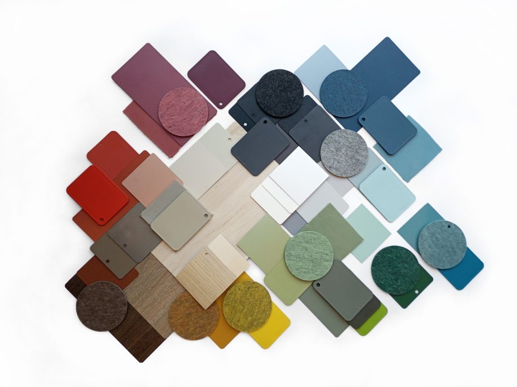
Colour carries meaning, emotion, and cultural weight — but not always in the ways we expect. A shade that feels calming in one setting can be overwhelming, symbolic, or even distracting in another. That’s why designing learning environments starts with understanding who the space is for and the context they bring with them. When we look beyond assumptions and consider culture, neurodiversity, and the science behind colour, we create classrooms that genuinely support focus, comfort, and wellbeing.
When Green makes you see Red
So, green is considered a calming colour, is it? Try telling that to a Rangers fan at a local derby at Ibrox on a Saturday afternoon. But then think about how, in many cultures around the world, green is associated with renewal, hope or good fortune. At the same time, it’s also the colour of mould - often linked with decay and disease. And if you’re sitting in a primary school in the glorious Yorkshire Dales, looking out over rolling fields and wearing an emerald uniform to boot, do you really need even more green around you? When you’re thinking about colour in a learning environment, the first thing to consider is culture and context. Who is it for, and where is it?


The Hidden Impact of Colour in Learning Spaces
That’s not to say there aren’t any rules in colour. Ever since it’s launch in 1983, the BBC breakfast television set has been red. Red sofa, red graphics, red lighting. Even the presenters frequently wore red: it’s a colour that wakes you up, so fired up with energy and passion, it’s also a colour frequently used when you’re looking to encourage interactive participation, such as in English, drama and music classrooms. But it’s not a colour that really supports neurodiversity so its use in schools should be with care. For example, studies have revealed that 85% of Autistic children perceive the colors more intensely in comparison to neuro-typical children. According to the Autism Education Trust, red [and yellow] “can impact on autistic pupils’ sensory experience of space, often being percieved as fluorescent and high-energy colours”. There are even reports that red could cause tantrums in autistic children as it could evoke pain associated with certain parts of the body.
Neurodiverse Design
Why Natural Colours Matter in the Classroom